
Exploratory data analysis is a critical initial step to building a machine learning model. Better understanding your data can make discovering outliers, feature engineering, and ultimately modeling more effective.
Some parts of exploratory data analysis, such as generating feature histograms and missing values counts, can be mostly automated. This article walks through an open source library I created that runs some basic automated EDA processes.
EDATK: Automated EDA Toolkit
To help speed up exploratory data analysis, I created edatk and open sourced the code. This allows you to install via pip and run automated eda with a few lines of code. It is still in alpha stages, so treat as a supplement to your existing eda workflow.
The main features of edatk are:
- Ease of Use: Running automated exploratory data analysis over a pandas dataframe is just one line of code.
- HTML Report Output: By providing a folder location, edatk will build an html report that presents visuals and tables in a clean manner.
- Target Column Exploration: This is one of the key features of edatk. Passing in an optional target_column parameter specifies to add visual layers and cues where possible, helping you spot trends between input features and the column you are predicting in a supervised machine learning setup. If your problem doesn’t fit a supervised machine learning pattern, you can simply ignore this parameter.
- Inferred Chart Types: Based on column types in your dataframe, edatk will infer which metrics to calculate and chart types to display.
For this demonstration, we’ll be using the common iris dataset. The dataset has various features of an iris plant and the task is to predict the species.
We won’t build a machine learning model in this article, but will run automated eda to spot trends that may be useful for selecting or building new features to incorporate into a model training.
Running Automated EDA
The main way to run edatk is as follows, with a couple critical steps:
- Import the library and load your dataset. For this demo, we use seaborn to load the iris dataset into a pandas dataframe.
- Run the auto_eda method, passing in your dataframe, save (output) location, and target column. The output location and target column are optional, but recommended if you can provide these values.
It’s that simple! Edatk runs through various routines based on the column types and cardinality of each column. Visualizations are automatically generated and an html report is built with the outputs. The full html report generated by the below code can be viewed here.
# Import library
import edatk as eda

# Load in your dataframe (using seaborn below as an example)
import seaborn as sns
df = sns.load_dataset('iris')

# Run auto eda, optionally pass in path for saving html report and target column
eda.auto_eda(df, save_path='C:\\Users\\username\\Documents\\edatk', target_column='species')
Analyzing Results
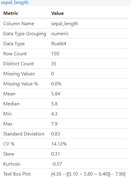
Single Column Statistics
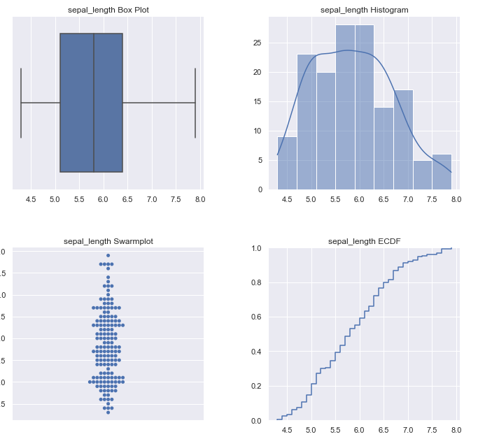
The first portion of the report loops through all the columns and calculates basic descriptive statistics. This takes the form of an initial table with min, max, percentage of rows with missing values, etc. The next portion shows some basic descriptive charts such as box plots and histograms.
The following screenshots show what gets generated for each column, with Sepal Length (one of the dataset features used to predict species) as the example.
Multiple Column Statistics
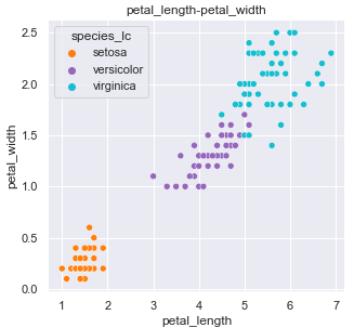
One of the most useful things of exploring your data is plotting feature pairs and analyzing against the target. This can give you ideas on how to engineer new features. If you pass in a target_column when calling auto_eda, many of these feature pair visualizations will include color coding according to this target variable. This makes it quick and easy to spot potential trends.
For example, one of the plots produced is a scatter plot with petal_length on the x axis and petal_width on the y axis. The three different types of species we are looking to train our model to predict are color coded. One can quickly spot some separation here. Including these two features alone should produce a decent starting point to a model. You could also potentially combine into one newly engineered feature to capture the relationship.
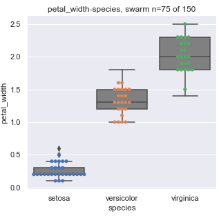
The generated visuals are not always scatter plots. The library looks at column types to determine the type of visualization that should be generated. For example, the categorical species column is plotted against petal_width using a box plot (example below).
Caveats
Edatk can handle some larger datasets (in terms of number of rows) as some sampling does occur for plots that are known to be performance intensive. However, since pair plot combinations are generated - an extremely wide dataset with a large number of columns may cause issues. The auto_eda method provides a column_list parameter to pass in a smaller list of column names in the event of this scenario.
Finally, edatk is still in alpha stages - so treat as a supplement to your existing eda workflow.
Contributing
This library is still a work in progress, but open sourced to all who wish to contribute to make it better!
The planned features can be viewed here on the github repo, as well as some basic instructions and git commands for those looking to make a first pull request.
Summary
Automated exploratory data analysis can help you better understand the data and spot initial trends.
Edatk is one such library that seeks to automate some of this work. Check it out and let me know what you think!
All examples and files available on Github.