A minimalistic approach to line chart labeling allows for quicker insights and data to stand out in a visualization. Using DAX and combo charts, a designer can extend Power BI’s out-of-the-box line chart labeling. To demo this technique, we’ll build a visualization comparing the number of lines spoken by various characters in the TV Series The Office.
Step 1: Build a Line Chart
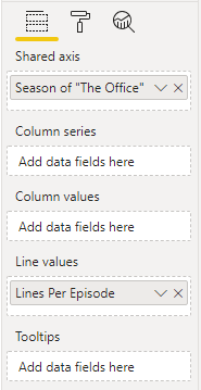
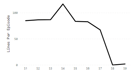
Start by building the line chart using the default Line and clustered column chart in Power BI. In Step 1, only the Shared axis and Line values fields are used. In this example - Season of “The Office” and Lines Per Episode.
I’ve also added some basic styling - changing text fonts, sizes, and centering. The line charts at this stage looks as follows:
Step 2: Create a DAX Measure for Start & End Labeling
We’ll add a DAX measure that returns a value for only the start and end of the X axis (the first and last season). Depending on the use case, the DAX will vary; however, the basic idea is to return a value when the criteria is met (start/end of our line) and otherwise return nothing (a blank in DAX).
Line Label Measure =
var min_label = CALCULATE(MIN(Scene[season]), ALL(Scene))
var max_label = CALCULATE(MAX(Scene[season]), ALL(Scene))

RETURN
IF(
    OR(
        MIN(Scene[season]) = min_label,
        MAX(Scene[season]) = max_label
    ),
    [Lines Per Episode]
)
Note, the default else condition for a DAX IF statement is BLANK() - this is implicit in the code above.
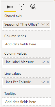
Step 3: Add the DAX Label Measure as a Column.
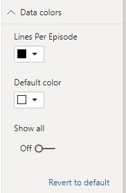
Add the new label measure in the Column values field. After this step, you’ll see a couple of columns appear - for the first and last value. We don’t actually want to show the columns - in the Data Colors formatting page, set the default color to white to hide them.
Step 4: Label Configuration
The final step is to configure labels. Our goal is to show the column labels, but hide them for the line. The columns (even though the bars are “hidden”) only return values for the first and last data points, giving the desired effect of start and end labeling only.
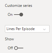
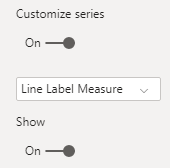
Labels
Turn on Data Labels in the formatting pane and set Customize Series to On. This allows each series (column and line) to be configured separately. Change the Show slider to Off for Line and On for the Column.
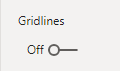
Gridlines
It’s also a good idea to turn off Gridlines (found in the Y Axis configuration). Our bars (while “hidden” with white fill) shouldn’t overlay on top of the gridlines.
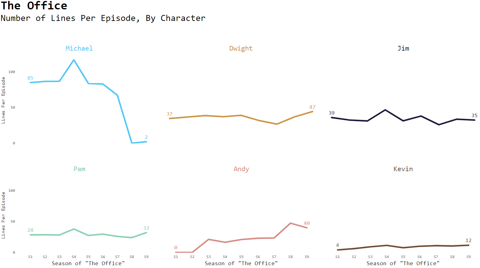
Final Result
Perform any additional styling or configuration as needed. I built small multiples for this dataset and removed non-data elements where possible to allow the data to take the center stage. Check out the final viz!
Summary
The approach of purposefully adding cues to your visualization while hiding extra elements can be an effective and efficient way to convey information.
Interested in your thoughts, if you find this approach helpful or have used different approaches to solve similar issues - comment below!
Materials available on Github, Data sourced from data.world.