Update 5/21/2020: Microsoft released the capability to toggle shadows directly in the Power BI application! Check out the end of this post for more information on the new feature.
Designing great user interfaces in Power BI is one way to increase use and adoption. Anything that makes the experience more intuitive or enjoyable might be the difference between all your hard work on a backend model seeing the light of day vs. sitting on the shelf. There are many different paths to go down in terms of design, with some great examples already out on the web - such as how to achieve shadowing/visual framing, using just objects built in PowerPoint.
Given the fact that many styling concepts boil down to shapes, colors, and shadows used behind other text or visual elements - the possibilities are certainly endless.
One area where we can gain inspiration is web design trends. Certain aspects of web design may be possible to implement in Power BI reports. In this post, I’ll walk through an example of how to implement a recent trend in Web UI design (Neumorphism) in Power BI.
Background
Before we start down the implementation details, what is Neumorphism? It’s also known as Soft UI. The idea is - rather than giving objects on a page a flat appearance…our goal here will be to achieve an almost raised plastic look, where visual boxes have some depth around them. This is similar to the shadowing effect you see in PowerPoint, with a few caveats:
- We use two shadows, a lighter and darker colored shadow to achieve the desired visual appearance.
- The background of our visual matches the background of our page and is not a flat white.
- The color of our shadows are specifically chosen based on the color of our background.
There is a great tool for playing around with the configurations and coloring options, neumorphism.io. You can also take a deeper dive behind the design trend here. Check them out, and when you’re ready - let’s dive into the Power BI implementation!
Step 1: Building the Web Components
The first step is getting images for the various web components that we’ll simply use as images in our Power BI report. This can be achieved through some simple HTML and CSS. The neumorphism.io site generated many of the details for us to use, such as color codes and pixel sizes. You can also play around with the width, height, and any other aspect to get it looking right for your report.
The HTML is as follows:
<!DOCTYPE html>
<html lang="en">
    <head>
        <title>Sample Chart</title>
        <meta charset="utf-8">
        <link rel="stylesheet" type="text/css" href="styles.css">
    </head>
    <body>
		<h1>Sample Chart</h1>

        <div class="neu_box"></div>

    </body>
</html>
The CSS (referenced as styles.css above) is as follows:
body{
    background-color: #EDCFCE;
}

.neu_box{
    margin: 100px;
    box-shadow:  10px 10px 30px #c9b0af,
                -10px -10px 30px #ffeeed;
    border-radius: 70px;
    width: 800px;
    height: 400px;
}
If you open any text editor and save the first code snippet as index.html and the second code snippet as styles.css (separate files in the same directory), you should be able to open the html file and see something like this:

As you can see, this matches the design styling we are going for, a sort of raised look that extrudes from the background to use behind our visuals for framing and making them pop. Of course, you can play around various options and colors on neumorphism.io and incorporate the generated border-radius, background-color, and box-shadow values into your styles.css file as needed.
Step 2: Incorporating into Power BI
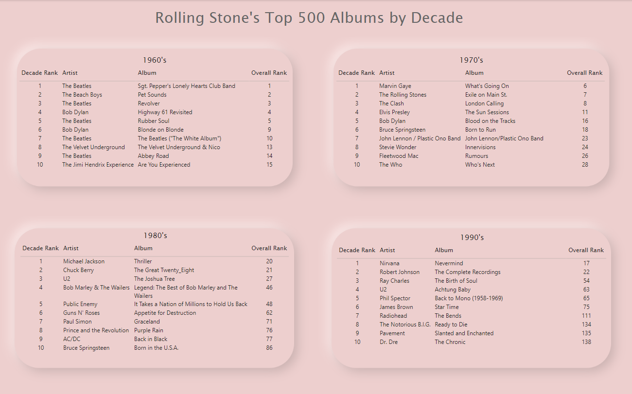
Once we have one or more of these visual background images (sized appropriately), we can incorporate the images into a Power BI report. I took four copies of the above image and added them as the bottom layer in a report (top albums from Rolling Stone magazine). Afterwards, I aligned the pixel sizes to the originally intended values and fitted the visuals on top. You can see the final result here:
Recap
This was a simple implementation of a particular trend in web design - meant to be an example of what is possible. I’m certainly not recommending that every report or scenario calls for incorporating neumorphism, web design elements, or shadowing. However, these tools and overall line of thinking about UI design can be used when you need to produce a report that is polished or has a certain visual styling to it. Even if you aren’t comfortable with web or UI design, don’t be afraid to try some of the concepts and ideas in your Power BI reports.
Experimenting is half the fun!
All examples and files available on Github.
May 2020 Update: Enabling Shadows Directly in the Power BI Application
Microsoft released the ability to enable shadows directly in the Power BI application with the May 2020 update! Check out an example from Power BI Guru David Eldersveld.